


Skeleton loaders are aimed at giving users the best experience during wait time before the actual web content is fetched and displayed. In this tutorial, we will discuss skeleton loaders, where they are used and key points to take note of when designing and developing one.
All this will culminate with a practical implementation of a skeleton loader in Next.js with Tailwind CSS.
Prerequisites
To follow through this tutorial, you will need to have:
- VS Code and Node.js installed on your machine.
- Worked with Next.js using TypeScript.
- Worked with Tailwind CSS.
- Used the browser Fetch API.
What is a skeleton loader?
A skeleton loader is a static and usually animated placeholder for the information that is still loading on an application. It is used to imitate the structure and appearance of the content that is still loading and that will eventually be displayed.
It is used to give the user a sense of how long the page will take to load. This creates a perception of reduced wait time.
Once the data is fully loaded the skeleton loader is immediately replaced with the actual content.
Why use a skeleton loader?
The following are some of the reasons why you should use a skeleton loader:
- To give the user a sense of how long the page will take to load.
- They give a sense of reduced wait time.
- To give a perception of progress.
- Create uncertainty since the actual loading time is unknown.
Appropriate use cases
Skeleton loaders are most appropriate for the following use cases:
- On high and heavy content pages when the user is waiting for the content to load e.g dashboard content etc.
- On components with a lot of content that is still loading e.g. blog post articles etc.
- To indicate loading more than one component e.g products on an eCommerce site.
- In place of a loading spinner for a better user experience.
When not to use skeleton loader
The following scenarios are not ideal to use a skeleton loader:
- On very small content pages.
- On very fast processes.
- When the content is already loaded.
- With very long processes e.g importing or uploading data.
Implementation
As a practical example, you will be implementing a skeleton loader in Next.js with Tailwind CSS on an app that fetches posts from an API and displays them as articles.
The following are the general steps to implement a skeleton loader in Next.js with Tailwind CSS:
Setup
Make sure your development environment is set up and ready with Node.js and VS Code.
Bootstrapping a Next.js application with Tailwind CSS
The simplest way to get started using Tailwind CSS in a Next.js project is to make use of the Next.js + Tailwind CSS Example. Within the directory you want to start your project, run the following command:
npx create-next-app --example with-tailwindcss with-tailwindcss-app
This makes use of npx and the create-next-app to bootstrap a basic Next.js app and automatically configures Tailwind CSS based on the official Next.js example.
Equally to manually configure Tailwind CSS, checkout the guide Tailwind CSS Configuration for a step by step procedure.
Installing packages and dependencies
Open the resulting directory with-tailwindcss in VS Code and run the following command on the integrated terminal to install the packages and dependencies:
npm install
Then, run the following command to start the development server:
npm run dev
This starts the development server and allows you to preview the app in your browser on localhost:3000.
Creating the UI components and TypeScript types
Within the project’s root folder, create the components and types directory. The components directory will contain the UI components that will make up the web pages.
The types directory will contain the TypeScript data types that will be used to validate the data used in the application.
Types
Within the types directory, create the following files:
export interface IArticle {
  userId: number
  id: number
  title: string
  body: string
}
Each article will be of type IArticle and will have a userId, id, title and body property. The userId and id will be of type number and the title and body will be of type string. This will be used to validate each article.
import { IArticle } from "./IArticle";

export interface IArticles {
  articles: [IArticle];
}
The articles will be an array of articles (arrays of type IArticle). This is the type that will be used to fetch the articles from the API and display the articles on the home page.
Components
Within the components directory, create the following files:
- The
Metacomponent:
import Head from 'next/head'

type Props = {
  title: string
  keywords: string
  description: string
}

export const Meta = ({ title, keywords, description }: Props) => {
  return (
    <Head>
      <meta name="viewport" content="width=device-width, initial-scale=1" />
      <meta name="keywords" content={keywords} />
      <meta name="description" content={description} />
      <meta charSet="utf-8" />
      <link rel="icon" href="/favicon.ico" />
      <title>{title}</title>
    </Head>
  )
}

Meta.defaultProps = {
  title: 'WebDev Newz',
  keywords: 'web development, programming news',
  description: 'Get the latest news in web dev',
}
This makes use of the Head component from Next.js to display the title, keywords and description of the page. This will be used on every page of the website taking in the title, keywords and description as props, useful for SEO.
If props are not provided, the default props will be used, provided by Meta.defaultProps.
- The
Footercomponent:
export const Footer = () => {
const currentYear = new Date().getFullYear();
return (
<>
<footer className="flex h-10 w-full items-center justify-center border-t">
<p className="flex items-center justify-center">© {currentYear}</p>
</footer>
</>
);
};
To display copyright symbol and current year on the footer. This will be used on every page of the application.
- The
Layoutcomponent:
import { Meta } from "./Meta";
import { Footer } from "./Footer";

export const Layout = ({ children }: any) => {
  return (
    <>
      <Meta />
      <div className="flex min-h-screen flex-col items-center justify-center py-2">
        {children}
      </div>
      <Footer />
    </>
  );
};
This will take in the Meta component, Footer component and all other pages as children. It defines the general layout of the website and enforces consistent styling across all pages.
The component is imported into the pages/_app.js file and wrapped around the <Component /> in the _app.js file. This is the component that is used to wrap all other components.
- The
_app.jsfile:
import "../styles/globals.css";
import type { AppProps } from "next/app";
import { Layout } from "../components/Layout";

function MyApp({ Component, pageProps }: AppProps) {
  return (
    <>
      <Layout>
        <Component {...pageProps} />
      </Layout>
    </>
  );
}

export default MyApp;
- The
ArticleItemcomponent:
import Link from "next/link";
import React from "react";
import { IArticle } from "../types/IArticle";
export const ArticleItem = ({ article }: { article: IArticle }) => {
return (
<>
<Link href={`/article/${article.id}`}>
<a className="mt-12 w-1/2 rounded-xl border p-6 text-left hover:text-blue-600 focus:text-blue-600">
<h3 className="text-2xl font-bold">{article.title} →</h3>
<p className="mt-4 text-xl">{article.body.slice(0, 100)}</p>
</a>
</Link>
</>
);
};
This will define the layout for each article on the home page, the article title and body. The whole article will be wrapped in a link to the article page. The article body will be truncated to 100 characters and displayed as an excerpt.
- The
ArticleListcomponent:
import { IArticles } from "../types/IArticles";
import { IArticle } from "../types/IArticle";
import { ArticleItem } from "./ArticleItem";

export const ArticlesList = ({ articles }: IArticles) => {
  return (
    <>
      <div className="flex flex-col items-center justify-around">
        {articles.map((article: IArticle) => (
          <ArticleItem key={article.id} article={article} />
        ))}
      </div>
    </>
  );
};
This will define how the articles will be displayed on the home page. It will take in the articles to display as a prop of type IArticles(an array of articles). Using the ArticleItem component, it will display each article in the articles array on the home page.
- The
SkeletonCardcomponent:
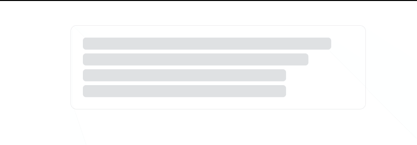
export const SkeletonCard = () => {
  return (
    <>
      <div className="flex w-full flex-1 flex-col items-center  px-20">
        <div className="mt-12 w-1/2 animate-pulse flex-row items-center justify-center space-x-1 rounded-xl border p-6 ">
          <div className="flex flex-col space-y-2">
            <div className="h-6 w-11/12 rounded-md bg-gray-300 "></div>
            <div className="h-6 w-10/12 rounded-md bg-gray-300 "></div>
            <div className="h-6 w-9/12 rounded-md bg-gray-300 "></div>
            <div className="h-6 w-9/12 rounded-md bg-gray-300 "></div>
          </div>
        </div>
      </div>
    </>
  );
};
The skeleton card mimics the layout of the article card. It uses the same styles and dimensions as the article card.
Make use of the Tailwind CSS utility class animate-pulse to produce the pulse animation effect on the card. This will be used to display the loading skeleton while the articles are being fetched from the API.
Fetching data from an API and displaying it on the home page
You will be sending a get request to https://jsonplaceholder.typicode.com/posts?_limit=10 to fetch 10 posts from the API. The post will be displayed on the home page of your Next.js app (the index.js file in the pages directory).
import { ArticlesList } from "../components/ArticlesList";
import { IArticles } from "../types/IArticles";
export const getStaticProps = async () => {
const res = await fetch(
"https://jsonplaceholder.typicode.com/posts?_limit=10"
);
const data = await res.json();
return {
props: {
articles: data,
},
};
};
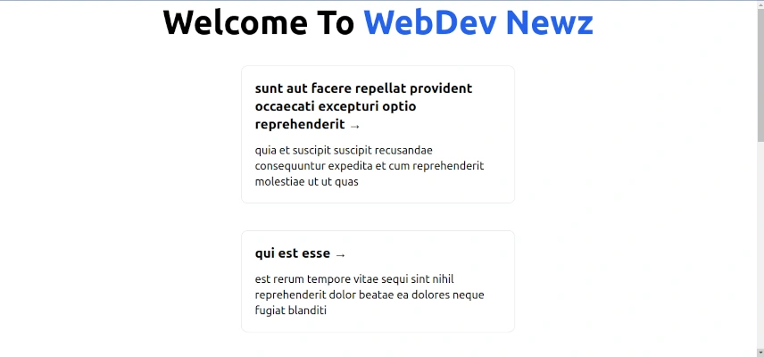
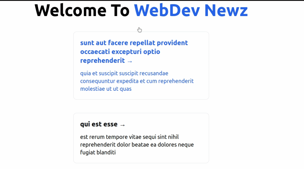
export default function Home({ articles }: IArticles) {
return (
<>
<div>
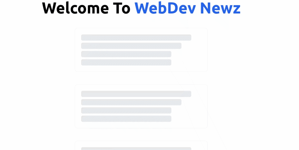
<h1 className="text-6xl font-bold">
Welcome To <span className="text-blue-600">WebDev Newz</span>
</h1>
</div>
<main className="flex w-full flex-1 flex-col items-center justify-center px-20 text-center">
<ArticlesList articles={articles} />
</main>
</>
);
}
Making use of the getStaticProps function from Next.js to fetch 10 articles from the API, format the data as an array of articles in JSON format. Afterwards, return it as props from the getStaticProps function.
The home page takes in the articles as a prop of type IArticles(an array of articles) and makes use of the ArticleList component to display the articles.
Adding the skeleton loader to the home page
Now refactor the ArticleList component to use the SkeletonCard component to display the loading effect before the articles are fetched from the API and displayed on the home page.
import React, { useEffect, useState } from "react";
import { IArticle } from "../types/IArticle";
import { IArticles } from "../types/IArticles";
import { ArticleItem } from "./ArticleItem";
import { SkeletonCard } from "./SkeletonCard";

export const ArticlesList = ({ articles }: IArticles) => {
  const [loading, setLoading] = useState(true);

  useEffect(() => {
    if (articles) {
      setTimeout(() => {
        setLoading(false);
      }, 30000);
    }
  }, [articles]);

  //Initialize an array of length 13 and fill it with 0's
  let skeletonCards = Array(3).fill(0);

  return (
    <>
      {loading ? (
        skeletonCards.map((index: number) => <SkeletonCard key={index} />)
      ) : (
        <div className="flex flex-col items-center justify-around">
          {articles.map((article: IArticle) => (
            <ArticleItem key={article.id} article={article} />
          ))}
        </div>
      )}
    </>
  );
};
Create a local state using the useState hook and set the loading state to true initially. This will be used to display the loading effect while the articles are being fetched from the API.
The useEffect hook will be used to set the loading state to false after the articles are fetched from the API. To simulate a longer loading time e.g in cases of fetching a huge number of heavy content, the setTimeout function is used to delay setting the loading state to false for 3 seconds. This makes the skeleton loading effect appear for a longer time.
Create a variable named skeletonCards and initialize it to an array of length 3 and filled with 0’s. This will be used to display 3 skeleton cards on the home page, an estimate of the actual number of possible articles that might occupy the viewport. This is just an estimate and can be varied by changing the number of items in the array to suit your needs.
Then making use of a ternary operator, check the loading state. If it is true make use of the skeletonCards variable to display the skeleton cards depending on the number of items in the array.
If the loading state is false then make use of the articles passed as a prop to display the articles.
Fetching article data and displaying it on the article page
Each article on the home page will be linked to the article page. The article page will display the article title, body, and a button to go back to the home page.
Within the pages directory, create a new directory called article. Inside the article directory, create a new file called [id].js.
The square brackets will be replaced with the article id.
import { Meta } from "../../components/Meta";
import { IArticle } from "../../types/IArticle";
import Link from "next/link";
import { SkeletonCard } from "../../components/SkeletonCard";
export const getStaticPaths = async () => {
const res = await fetch("https://jsonplaceholder.typicode.com/posts");
const articles = await res.json();
const paths = articles.map((article: IArticle) => ({
params: { id: article.id.toString() },
}));
return {
paths,
fallback: false,
};
};
export const getStaticProps = async ({ params }: any) => {
const res = await fetch(
`https://jsonplaceholder.typicode.com/posts/${params.id}`
);
const article = await res.json();
return {
props: {
article,
},
};
};
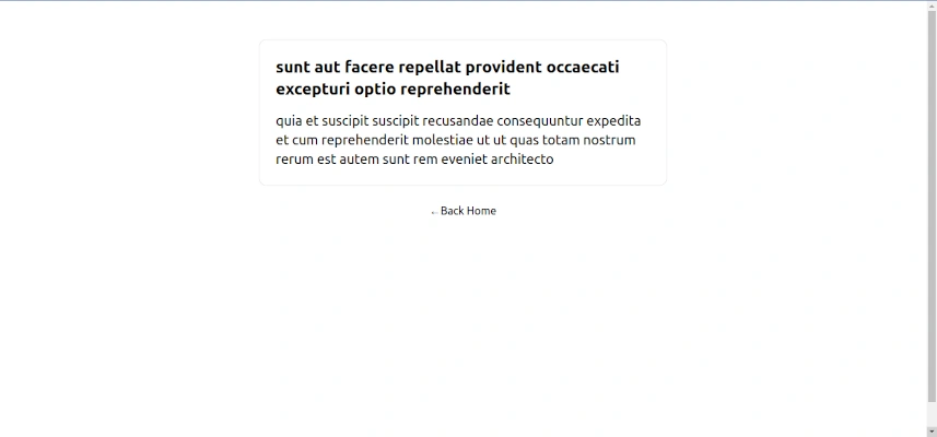
const article = ({ article }: { article: IArticle }) => {
return (
<>
<Meta title={article.title} description={article.body.slice(0, 20)} />
<main className="flex w-full flex-1 flex-col items-center px-20 text-center">
<div className="mt-12 w-1/2 rounded-xl border p-6 text-left">
<h1 className="text-2xl font-bold">{article.title}</h1>
<p className="mt-4 text-xl">{article.body}</p>
</div>
<button className="mt-6 hover:text-blue-600 focus:text-blue-600">
<Link href="/">
<a>←Back Home</a>
</Link>
</button>
</main>
</>
);
};
export default article;
This is a dynamic route that will be used to display each of the articles on an individual page. The getStaticPaths function will be used to fetch all the articles from the API and return all the possible values of the id parameter.
The getStaticProps function will be used to fetch the article with the id that matches the id parameter and return it as a prop. The article page takes in the article as a prop of type IArticle (an article).
It also makes use of the Meta component to display the article title and description (the article body truncated to 20 characters). The article title and body will be displayed on the page. The article page will also display a button to go back to the home page.
Adding the skeleton loader to the article page
Likewise, refactor the article page to use the SkeletonCard component to display the loading effect before the article is fetched from the API and displayed on the page.
import React, { useEffect, useState } from "react";
const article = ({ article }: { article: IArticle }) => {
const [loading, setLoading] = useState(true);
useEffect(() => {
if (article) {
setTimeout(() => {
setLoading(false);
}, 3000);
}
}, [article]);
return (
<>
{loading ? (
<SkeletonCard />
) : (
<>
<Meta title={article.title} description={article.body.slice(0, 20)} />
<main className="flex w-full flex-1 flex-col items-center px-20 text-center">
<div className="mt-12 w-1/2 rounded-xl border p-6 text-left">
<h1 className="text-2xl font-bold">{article.title}</h1>
<p className="mt-4 text-xl">{article.body}</p>
</div>
<button className="mt-6 hover:text-blue-600 focus:text-blue-600">
<Link href="/">
<a>←Back Home</a>
</Link>
</button>
</main>
</>
)}
</>
);
};
export default article;
Now make use of the useState hook to set the loading state to true initially. This will be used to display the loading effect before the article is fetched from the API and displayed.
The useEffect hook will be used to set the loading state to false after the article is fetched from the API. To simulate a longer loading time e.g in cases of fetching huge or heavy content articles, the setTimeout function is used to delay setting the loading state to false for 3 seconds. This again makes the skeleton loading effect appear for a longer time.
Here is the link to the complete code on GitHub .
Conclusion
Skeleton loading screens are a great way to keep your users engaged while your application is loading or fetching content. It gives the user a view of what the content will look like when it is fully loaded giving a sense of progress.
Skeleton loading screens greatly improve the user experience as compared to a bare blank screen or a loading spinner.
Feel free to use the code on this page as a starting point to create your skeleton loading components that suit your application needs. You are welcome to share this article and give feedback in the comments section below.
Happy coding!


Comments: