


When developing web designs, one of the most important things to put attention to is user interaction. A good example of this is by the use of modal dialogs.
A modal is a popup window that appears on top of the main content of a webpage seeking user interaction.
It appears at the top of the main content and forces the user to interact with it before continuing with their work.
Modal dialogs are helpful because they give critical warnings to the user as a way of preventing errors.
Throughout this tutorial, we will be using Tailwind to create and style up our modal dialog. We will also use JavaScript to add functionality to it.
The modal dialog will look like the one below:
Prerequisites
To follow through this article, you will need to have:
- Latest version of Tailwind CSS installed
- Knowledge of Tailwind CSS
- Knowledge of JavaScript functions
Adding Tailwind CSS to your project
I assume that you already have Tailwind installed. If not, visit this article for the full Tailwind installation process.
Let’s get started!
Creating a Button that will open the modal dialog
For your HTML, make sure to correctly link your Tailwind CSS stylesheet as shown below:
<!DOCTYPE html>
<html lang="en">
	<head>
		<meta charset="UTF-8" />
		<meta http-equiv="X-UA-Compatible" content="IE=edge" />
		<meta name="viewport" content="width=device-width, initial-scale=1.0" />
		<title>Document</title>
		<link rel="stylesheet" href="./public/tailwind.css" />
	</head>
</html>
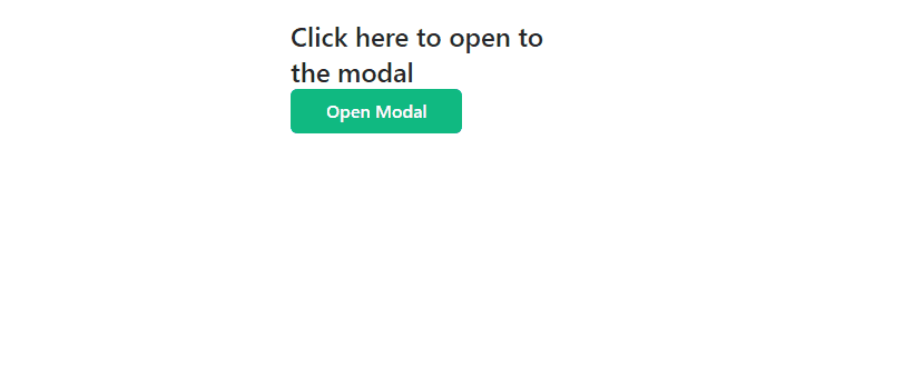
Next, add a div container under the <body> tag. It will add some content and a button that will open the modal dialog when clicked.
The classes are as shown below:
<div class="w-80 mx-auto mt-5 p-7">
	<p class="text-2xl font-medium text-gray-800">
		Click here to open to the modal
	</p>
	<button
		class="bg-green-500 text-white rounded-md px-8 py-2 text-base font-medium hover:bg-green-600 focus:outline-none focus:ring-2 focus:ring-green-300"
		id="open-btn"
	>
		Open Modal
	</button>
</div>
In simpler terms, we have added instructions to our page. The instructions tell you to click on the button created below it.
We have created an id for the button – open-btn. It will be used to identify the button when scripting.
Adding an overlay effect
In most web pages, when a dialog opens, the background becomes inactive. This means that the content behind the modal dialog cannot be accessed until the user interacts with it. This is called an overlay effect.
We are going to create the effect with just a few lines of code, as shown below:
<!--Overlay Effect-->
<div
	class="fixed hidden inset-0 bg-gray-600 bg-opacity-50 overflow-y-auto h-full w-full"
	id="my-modal"
></div>
What this means is that when the dialog pops up, the effect will be seen as a faded gray color. It will also fill the entire screen; achieved by adding the class inset-0.
The effect is hidden by default using class hidden. It will not be visible until the modal appears.
There’s also an id– my-modal which will be used in the script.
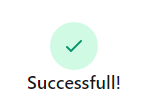
Creating the modal dialog
At the beginning of this tutorial, we mentioned that modal dialogs give users critical warnings.
For example, if a user wants to delete some content, a window will pop up with a question like Are you sure you want to delete this?. It comes with choices like OK or CANCEL.
In a modal window like that, the user is required to check if they really wish to delete that particular thing. If yes, then click on the OK button and CANCEL if they are not sure.
In our case, we are going to create a pop-up window similar to the one seen when an account is successfully registered.
Let’s get to it.
We will create a div where we will place our modal content. It will act as a container for an icon, text, and a button.
The classes will be as follows:
<!--modal content-->
<div
	class="relative top-20 mx-auto p-5 border w-96 shadow-lg rounded-md bg-white"
>
	<div class="mt-3 text-center">
		<div
			class="mx-auto flex items-center justify-center h-12 w-12 rounded-full bg-green-100"
		>
			<svg
				class="h-6 w-6 text-green-600"
				fill="none"
				stroke="currentColor"
				viewBox="0 0 24 24"
				xmlns="http://www.w3.org/2000/svg"
			>
				<path
					stroke-linecap="round"
					stroke-linejoin="round"
					stroke-width="2"
					d="M5 13l4 4L19 7"
				></path>
			</svg>
		</div>
		<h3 class="text-lg leading-6 font-medium text-gray-900">Successful!</h3>
		<div class="mt-2 px-7 py-3">
			<p class="text-sm text-gray-500">
				Account has been successfully registered!
			</p>
		</div>
		<div class="items-center px-4 py-3">
			<button
				id="ok-btn"
				class="px-4 py-2 bg-green-500 text-white text-base font-medium rounded-md w-full shadow-sm hover:bg-green-600 focus:outline-none focus:ring-2 focus:ring-green-300"
			>
				OK
			</button>
		</div>
	</div>
</div>
In the code above:
- We have added classes that will help us correctly align our items inside the parent
</div>. The container is positioned away from the top margin by using the classtop-20. Classrelativewill make this possible.mx-autowill center it on the screen. - We will then add another child
divinto which the icon, text, and button will be placed, as shown below:
<div class="mt-3 text-center"></div>
In the code above, the class:
mt-3adds a top margin of 12px.text-centercenters all the text present.
Now, let us add some content so our styling can be applied.
We will create a <div> for that, with the following classes:
<div
	class="mx-auto flex items-center justify-center h-12 w-12 rounded-full bg-green-100"
>
	<svg
		class="h-6 w-6 text-green-600"
		fill="none"
		stroke="currentColor"
		viewBox="0 0 24 24"
		xmlns="http://www.w3.org/2000/svg"
	>
		<path
			stroke-linecap="round"
			stroke-linejoin="round"
			stroke-width="2"
			d="M5 13l4 4L19 7"
		></path>
	</svg>
</div>
The icon has a height and width of 24px. It also has a green color and a background too to make it pop. We have added classes mx-auto, flex, items-center, and justify-center to align our icon to the center.
This is how it looks like at this point:
Afterwards, we will add some content to our popup window as shown below:
<h3 class="text-lg font-medium text-gray-900">Successful!</h3>
<div class="mt-2 text-center">
	<p class="text-sm text-gray-500">Account has been successfully registered!</p>
</div>
The h3 tag has the following classes:
text-lgadds a font size of 18px.font-mediumchanges the font weight to 500.text-gray-900changes the font color of the text to gray.
We have added the div tag so that we can align the text as shown below:
mt-2adds a top margin of 8px.text-centeraligns the text to the center.
Now, we will add another div which will contain the OK button as shown:
<div class="items-center px-4 py-3">
	<button
		id="ok-btn"
		class="px-4 py-2 bg-green-500 text-white text-base font-medium rounded-md w-full shadow-sm hover:bg-green-600 focus:outline-none focus:ring-2 focus:ring-green-300"
	>
		OK
	</button>
</div>
We have added the following classes to the div:
px-4andpy-3adds a padding of 16px to the x-axis and 8px to the y-axis.items-centercenters the button to the container.
To the button, we gave it a green background color. It has acquired the same width as its container because of class w-full. We have made its edges rounded, given it a small shadow, and a hover effect.
Other classes are explained below:
hover:bg-green-600adds a hover effect on the button by changing the background color to green.focus:outline-noneremoves the outline border when the button is clicked.focus:ring-2creates an outline ring to the button.focus:ring-green-300creates a green outline ring.
For scripting, we have also given our button an ID – ok-btn.
We are done designing our modal dialog!
Adding functionality to our modal dialog
We will add functionality to the buttons we have created using simple JavaScript code.
We will grab all the elements that we want to add functionality to by using the unique identifiers that we had given them earlier.
We will add Javascript at the bottom of the page using <script> tag.
    // Grabs all the Elements by their IDs which we had given them
    let modal = document.getElementById("my-modal");

    let btn = document.getElementById("open-btn");

    let button = document.getElementById("ok-btn");
We also want the modal to open when the Open button is clicked and to close when the OK button is clicked.
This is how we will do it:
    // We want the modal to open when the Open button is clicked
    btn.onclick = function() {
    modal.style.display = "block";
    }
    // We want the modal to close when the OK button is clicked
    button.onclick = function() {
    modal.style.display = "none";
    }
Our modal dialog is now functional.
Furthermore, we want it to close when the user clicks anywhere outside the it.
This is how we will do it:
    // The modal will close when the user clicks anywhere outside the modal
    window.onclick = function(event) {
    if (event.target == modal) {
        modal.style.display = "none";
    }
    }
Conclusion
In this tutorial, we have gone through creating and styling up our modal dialog with Tailwind CSS. We have also learned how to use JavaScript functions to make our modal dialog functional.
A modal dialog is one of the many examples of things that can be used to improve user interactivity.
I hope you find this tutorial useful.
Happy coding!


Comments: